Ranking the 2023 Super League Home Kits (Friday 9th December 2022)
The World Cup is no over and what a World Cup it was. It may seem ages away, but all focus has now returned to domestic rugby league. With the start of Super League '23 69 days away, it's time for the first blog of the new season. All teams have now released their new home shirts for 2023 and there are some brilliant ones. I ranked them all from worst to best, and it was actually quite difficult in some places. Without further ado, lets get into it.
12. Castleford Tigers

This shirt is really unpleasant in my opinion. I really don't get what the aim here was. It's very mismatch. I'm not a fan of how the block colours goes from orange to black so suddenly. The first black line at the top looks out of place. I do, however, like the arms. I think the black with orange rims works really well. I also do quite like the sponsor too but even that looks a bit out of place on the background. There is far too much going on here and not much of it works, hence the last place.
11. Warrington Wolves
An area of the table Warrington are all too familiar with after last season. This shirt is really plain. I don't like the sponsor which is a big issue considering the shirt is virtually built around the sponsor. I don't think the primrose and blue on the shoulders work either, it just doesn't look right. The bottom of the arms are quite nice however and so are the sponsors at the top. That's what saves the shirt from stealing bottom place off the Castleford. Fair enough, Warrington have tried to do something different but it just looks like a really poor away shirt- I'm really not a fan!
10. Leeds Rhinos
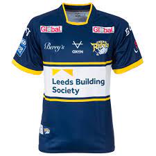
This is an interesting one and you could argue it doesn't deserve to be this low down. The main problem with this is that it just isn't Leeds. The shade of blue is the wrong one for Leeds. Also, the fact that there is more white than amber on the shirt just really isn't Leeds either. Talking of white, the white box looks out of place. I get that it's for the sponsor but it really doesn't fit the shirt and really shouldn't be that big. Other than that, I think it's a beautiful shirt. It's just not Leeds. If it was an away shirt, it would be higher up. I would also this looks way worse in person. That is why it sits so low.
9. Leigh Leopards

It's a jaguar not a leopard. That should be reasoning enough. Joking aside, I like the design- I like it a lot. I think the red eyes also are a very cool addition to the shirt. However, the rest of the red looks awful. Whoever it was who suggested red shorts, red trimmings and a red name and number needs help. The original kit was much much nicer and had no red on. If it was that kit, it'd be up near the top. Just why change it? Awful rebrand, not much better shirt.
8. Wigan Warriors

If you are a football fan as well as rugby, you'll probably be familiar with Atletico Madrid's home shirt from last season. Well this is quite similar- but a lot worse. I don't really know how to explain why I don't like this, but I don't. The lighter red on the white is very blocky. I don't think that works with shirts like this as it is almost sort of suppose to be stains rather than Adam Sandler's light gun ammo from 'Pixels'. Also, what is going on at the bottom- why does the red drift into the white properly rather than the lighter, blocky red? It doesn't look right at all. Other than that, I like this shirt. Nevertheless, due to what I've mentioned, it's understandable why it's low down in my opinion.
7. Catalans Dragons

This is very similar to the Warrington shirt in the sense that there is not a lot going on. However, I do really like the chevron and sponsor. It's very Catalans and works well. I don't like the rims of the arms- it ruins what the shirt seems to be going for. It is just confusing to me as it doesn't look great to me. The collar I'm not convinced on either. Nevertheless, you can't go that wrong with a simple shirt like this hence it's mid table position. That away shirt is beautiful by the way and when I rank those, probably during the Christmas period, that will be quite high up. However, this is home shirts so that is a story for another day.
6. Hull Kingston Rovers
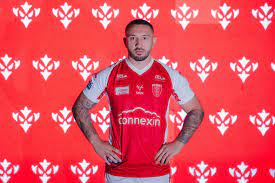
It's a really good shirt from the Rovers this. The thing that let's it down is it is so common. The contrast between their traditional red and white is used really well here, however. I think the red could be a lot wider at the top though. The sponsor really works on the shirt, and the little logo on the underside of the arms are really nice. They are also quite unique. Other than that, it's a really common design and kit. It does look quite smart and generally quite pleasing to the eyes however, which is why it sits higher up than some other shirts.
5. Salford Red Devils

We are really starting to get into the great shirts now. The chevron here with a small red line is fantastic. I think the way it moves into the sponsor is also very unique and works very well. It could be argued that the sponsor is too big but that's a very minor detail. I do think the red line across the shoulders does look a bit weird too. It seems unnecessary. I also think the design on the rims should go the whole way round rather than just half way round. The names on the shirt are also a nice thought and addition, but it does make the shirt appear a bit fuzzy and make my eyes go a bit funny, so I'm 50/50 on that aspect. Nevertheless, if the red was a bit lighter this would be a sensational shirt. A really good job from Salford!
4. Hull FC
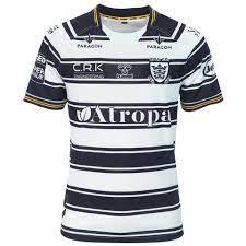
This shirt I actually own and I love it. The irregular black and white hoops are back and look stunning. The gold trimming on the arms really contrasts the black and white design. The sponsors work so well too. The badge is sown on to the shirt rather than sown in too, which is weird and perhaps not the best. It probably doesn't look the best either. The Super League badge isn't complimented by the design but this won't be a problem for fans purchasing the shirt. This is undoubtedly one of the best Hull shirts in the last few years and there isn't much to fault with it. Nevertheless, 3 teams just knock it off top spot.
3. Huddersfield Giants
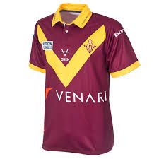
This is a sensational shirt. The amount of tradition and heritage Huddersfield have managed to get into this is incredible. The sponsors and colours work so well and are Huddersfield all over. The traditional collar is also really nice, but that is where my only criticism is. The collar is huge and looks too big, especially on the picture of Will Pryce wearing it. If it was a bit smaller and subtler, this would be the perfect shirt. However, the size of the collar just restricts this beautiful shirt from the top two.
2. St. Helens

This screams 'if it's not broken, why fix it?' It is very similar to all Saints shirts but it is just fantastic. The chevron is nice and the simplicity works well unlike some of the other shirts in this list. There is a really nice pattern in the red chevron too. That pushes this shirt up the list too, and so does the collar. My only criticism of this shirt is the sponsors on the arm. Why are there so many on the arms, surely they could be spread out a bit? Other than that, it's a really smart shirt and Saints have done a good job.
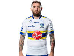
1. Wakefield Trinity
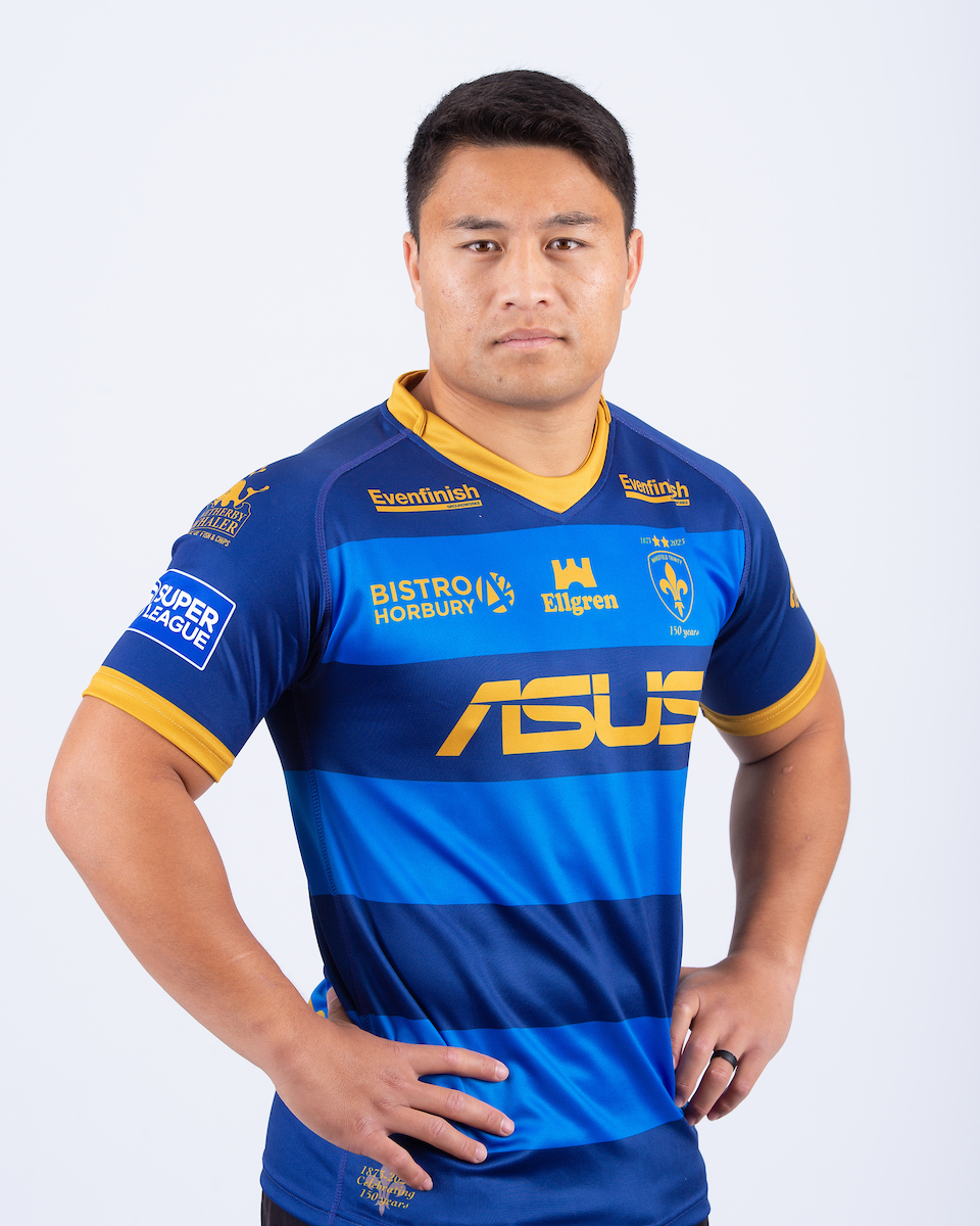
It's almost as if the table has been flipped because Wakefield come out on top this year. The contrast of blues is really nice and each shade of blue compliments the other. The use of yellow for the trimmings and sponsors also works well with the blue. The sponsors are all the right size, you don't get hit in the face by them like Mariah Carey on the 1st of December like some other shirts on this list. It's different from Wakefield's other shirts but this one really works. You could argue it would be better as an away shirt, but even as a home shirt it works tremendously well. I've got nothing to fault with this shirt, hence why it takes the deserved top spot!
There we go then, all the home shirts have been ranked. As I said earlier, there are some stunners this year but Wakefield's is no doubt the best. There's 69 days until the new season begins, we are starting to get close finally! Thankyou for reading, I'll be back with another blog soon!

Comments
Post a Comment